
November 2019 to December 2019
Mame
Redesign website
At a glance
As part of a school project and in a group of 2 people, we had to redesign the Mame site, which is an arcade game emulator. Our working method consists in starting with arcade games monitoring, proposing user tests to understand our target to create personalities, rebuild the site architecture, create a GUI and finish by prototyping it.
Software
Blender 3D
After-Effect
Illustrator
Photoshop
Sketch
Principle
What I did
UX·UI design
Information architecture
Graphic design
Motion design
3D animation
User research
The problem
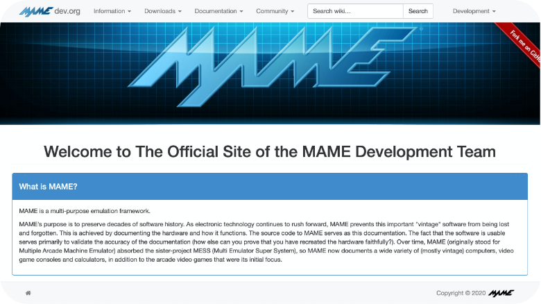
The original Mame site is a site that has not been redesigned since 1999. As a result, its architecture is not adapted to the number of updates and data that have accumulated over time.
Moreover, it is a site that was made for people who initially know the web development field well, which makes it unsuitable for new users who would like to discover this world.
Link to the Mame website
Application “InTheCloud” - Login Page
The Solution
We have restructured the architecture of the Mame site and created a tree structure to simplify the user’s journey. In this tree structure, we propose several paths that correspond to the needs of our targets. For the GUI, we have simplified the labels, created new picots and used a typography (Silom) that correspond to the graphic universe of the Arcade. The colors come directly from the Mame logo, which allows us to remain consistent with the universe of the site. In order to give a good understanding of our prototype, we propose a presentation video.
Steps of the project
01 UX Design
- · Audit
- · Qualitative : User test
- · Personae
- · Architecture
02 UI Design
- · Wireframe
- · Graphic charter
- · Logo
03 UX Design
- · Front Page
- · Category Page
- · Game Page
- · Description Page
- · Lists of update
04 Solution
- · Prototype
- · Evaluation
- · Lesson learn
UX Design
UX DESIGN
Audit
Our audit identifies all the problems of the website and then we analyze the consequences that this brings.
Problems
· Too much text everywhere
· Not enough illustrations (game images)
· Bad organization of the information (installation button too low in the page)
· Not enough color to distinguish sections
· Too much scroll down
· Most of the wording is difficult to understand
Consequences
· Difficult to understand
· The user is not hooked to the site and it doesn’t help them understand what the site is about
· It takes time to find the information he needs.
· The user can get lost between the different sections and so lose time to access the information he is looking for
· If the user is looking for information about a previous update, they must scroll down until they find the one they are looking for
· Several different wordings achieve the same result and are not always clear
UX DESIGN
Analysis · Audit
Following the discovery of the problems and the list of consequences that follow. We can define the parts most requested by users that we will highlight and those that are minor that will be displayed in the background but with accessibility and intuitive navigation.
UX DESIGN
Qualitative : User test
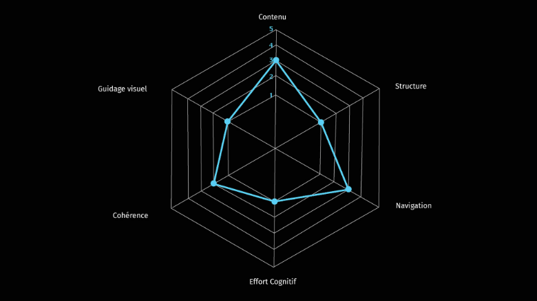
To clearly define our objective at the beginning of our research. We carried out user tests on a dozen people based on the SUS test, which in ten questions allows us to find the weak points of a website. We used it on the Mame website and decided to represent the result by a graph.
Survey - Calendar result
Survey - Note result
UX DESIGN
Analysis · Qualitative : User test
The analysis of the SUS test allows us to conclude that the major problems of the site come from its structure, visual guidance and cognitive effort.
UX DESIGN
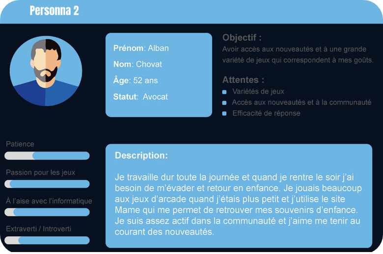
Personae
For our project, we have created two personae who exploit two possibilities. One is a new user who is not very comfortable with the technology and the other is a regular user who is experienced in the field of computer technology.
Personae - Beginner
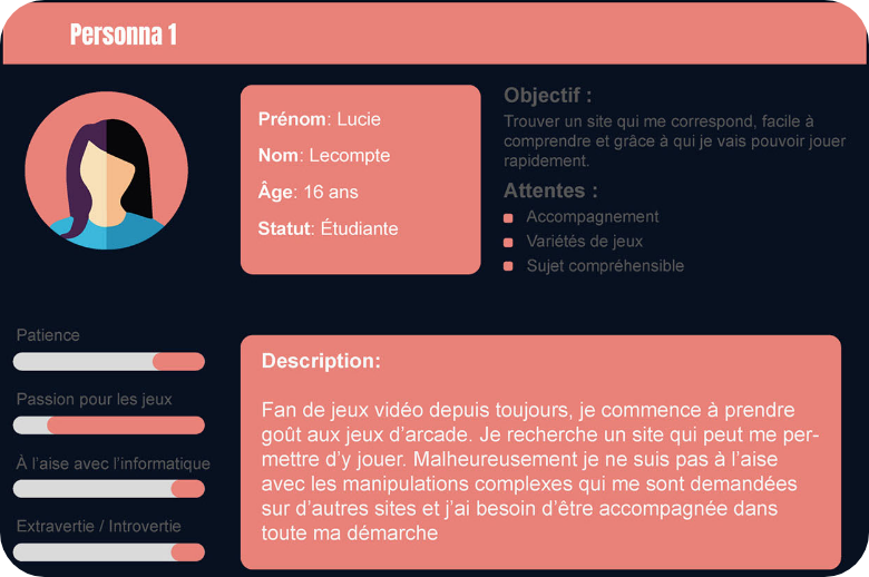
Personae - Professional
UX DESIGN
Analysis · Personae
These two personas allow me to start designing the features that will be part of the solution I will propose to the problem under study.
UX DESIGN
Architecture
We have restructured the architecture of the Mame site, and created a tree structure to simplify the user experience. This is one of our main objectives following the analysis of the SUS test.
Architecture - Mame redesign
UX DESIGN
Analysis · Architecture
In this tree structure, we propose two color paths that correspond to the needs of our two targets that we propose in the personae. Red for the beginner and blue for the professional.
UI Design
UI DESIGN
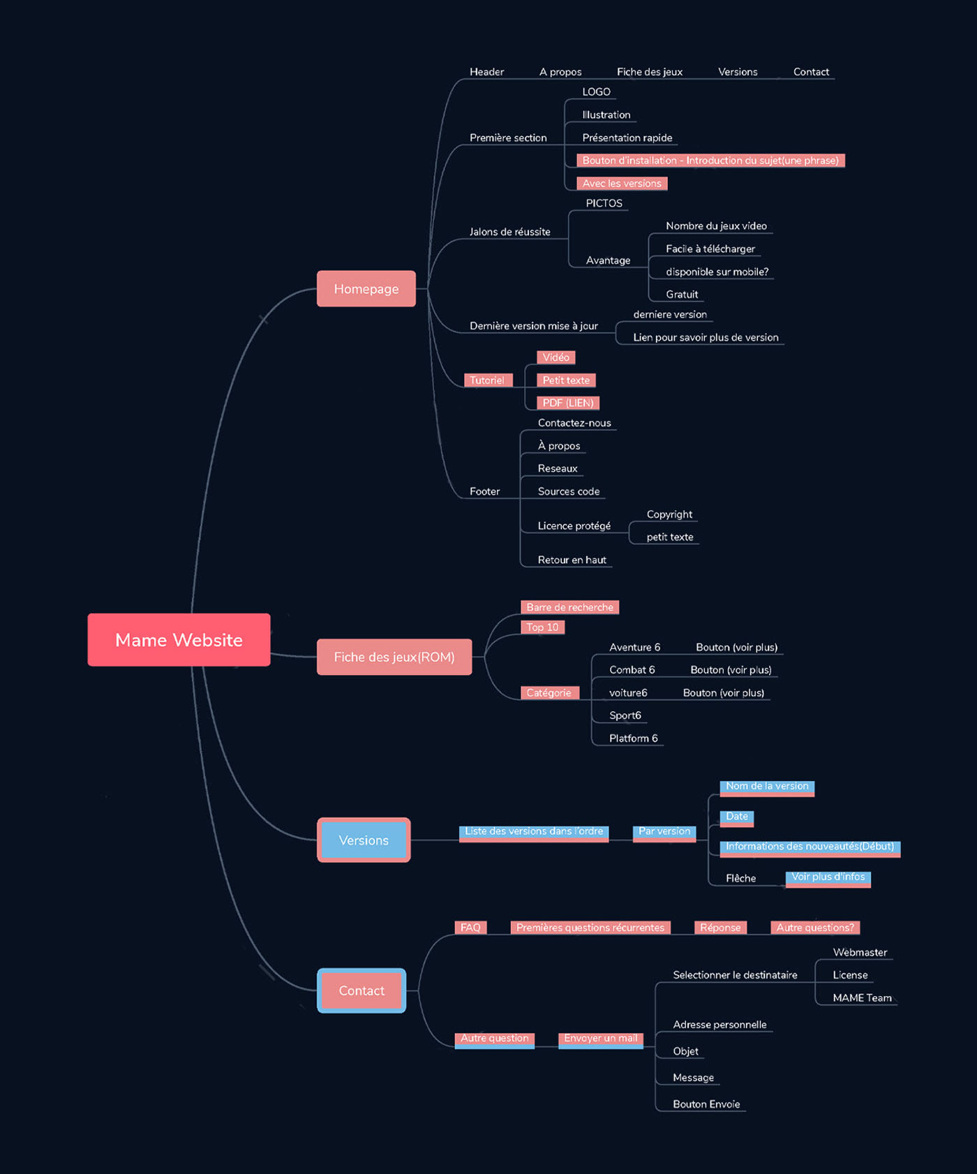
Wireframe, New logo & Graphic Charter
Wireframe - Mame redesign
New logo - Mame redesign
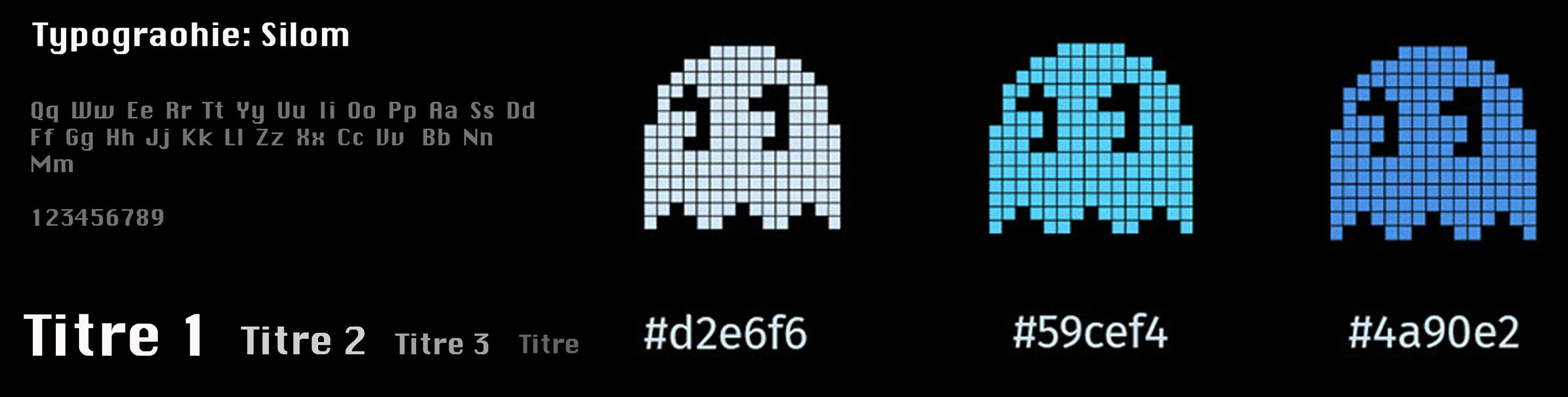
Graphic charter - Mame redesign
UI DESIGN
Analysis · Logo & Graphic Charter
In this tree structure, we propose two color paths that correspond to the needs of our two targets that we propose in the personae. Red for the beginner and blue for the professional.
Test & Iteration
UX DESIGN
Front page
In this page, we have reorganized all the information taking into account the level of importance the user needs on the first page.
We have reduced the header to three possible choices (Games, version and contact). This way, he will quickly find the information he will need. If his goal is to download the “Mame” application, he can already do it when the site opens thanks to the download button. We also show its compatibility with Mac OS, Windows and Linux.
Thanks to the title “The best of the emulator for Arcade”, we have made sure that the user understands the subject of the site as soon as he arrives. The three sections that make up our home page are the success milestones, the latest shared version and a tutorial to get started with the Mame application.
With all this, a new user has all the information he needs to start playing the arcade game emulator.
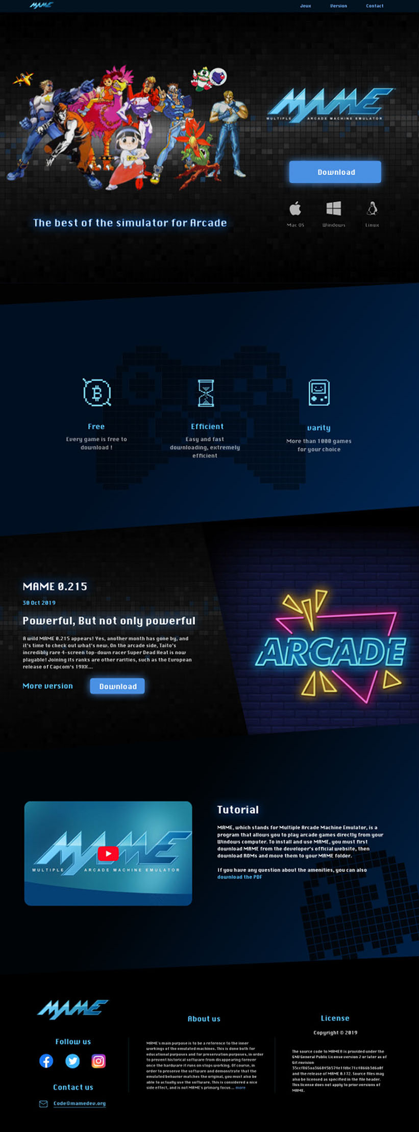
Home Page - Mame redesign
TEST & ITERATION
Category Page
The design of the game theme choices page takes the shape of the Mame logo. We don’t use pixel art images like arcade games but good quality and current images so that the user understands which theme refers to each type of game.
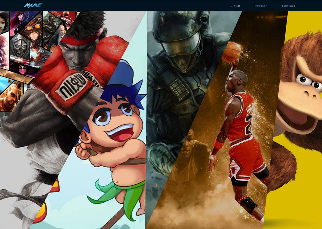
Game Page - Mame redesign
TEST & ITERATION
Description Page
We have respected the contents of the original site by reorganizing the information and separating the page into three parts.
The first one which defines the game (name, theme, edition) and introduces the person who made it available. The second one are images of the game that allow to see an example of the game we are going to play. And the third is a description of the game.
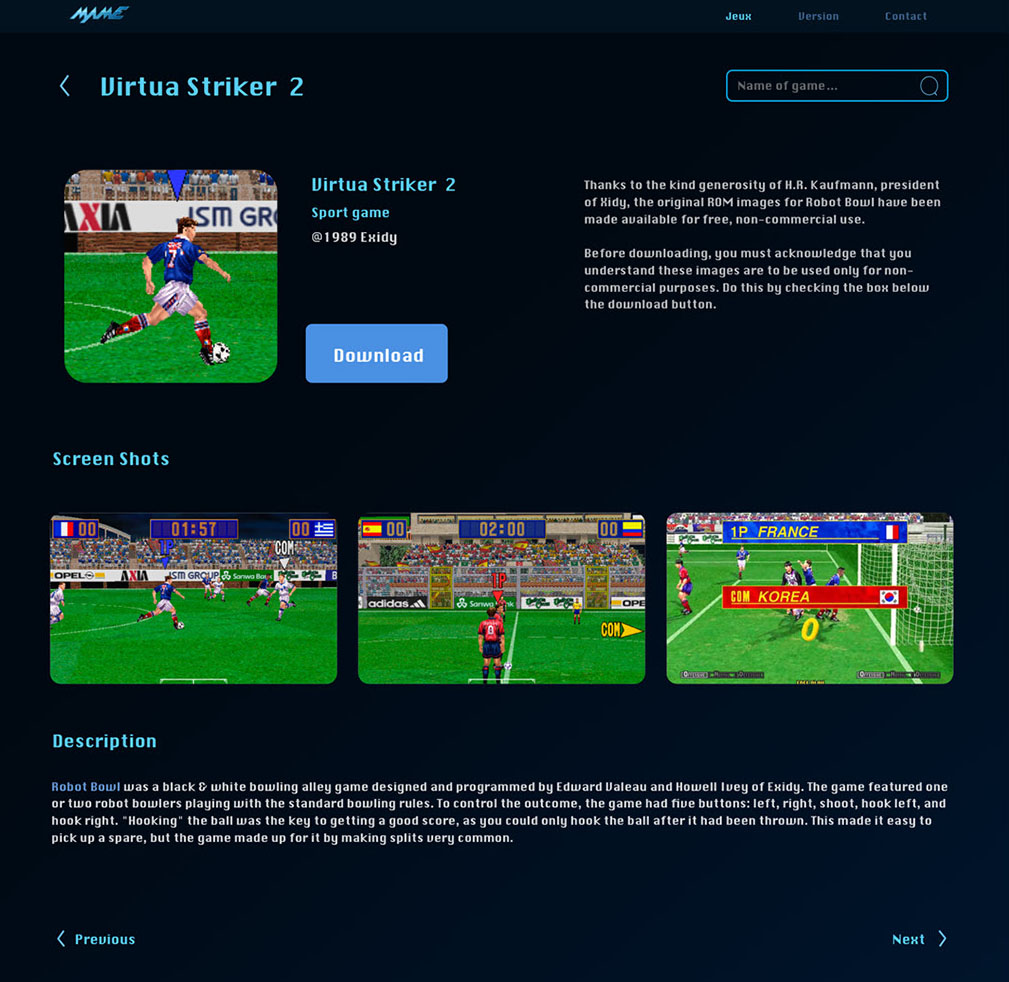
Description Page - Mame redesign
TEST & ITERATION
Games Page
When the user has chosen a type of game, he will arrive on the list of games that refer to it. The organization of this page is based on prioritization.
We propose a classification by date, name and edition.
By default, a top 10 of the most downloaded games is displayed first, followed by complete lists of all games.The icon of each game is a picture of the game in question.
You can just hover over a game icon to get a hover effect that allows you to click on a download button to download a game more quickly.
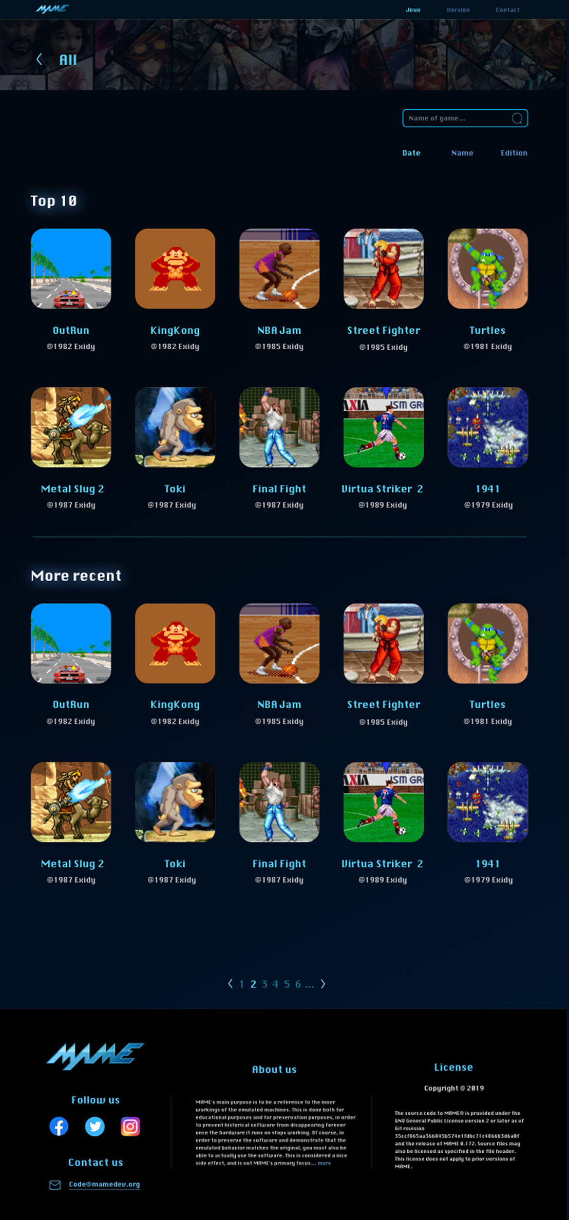
Game Page - Mame redesign
UX DESIGN
Lists of updates
We have improved access to version information. You can now access the version you are looking for in less than 3 clicks. The version list is on the left and the version description is on the right. The left part is modular in order to increase or decrease the description part.
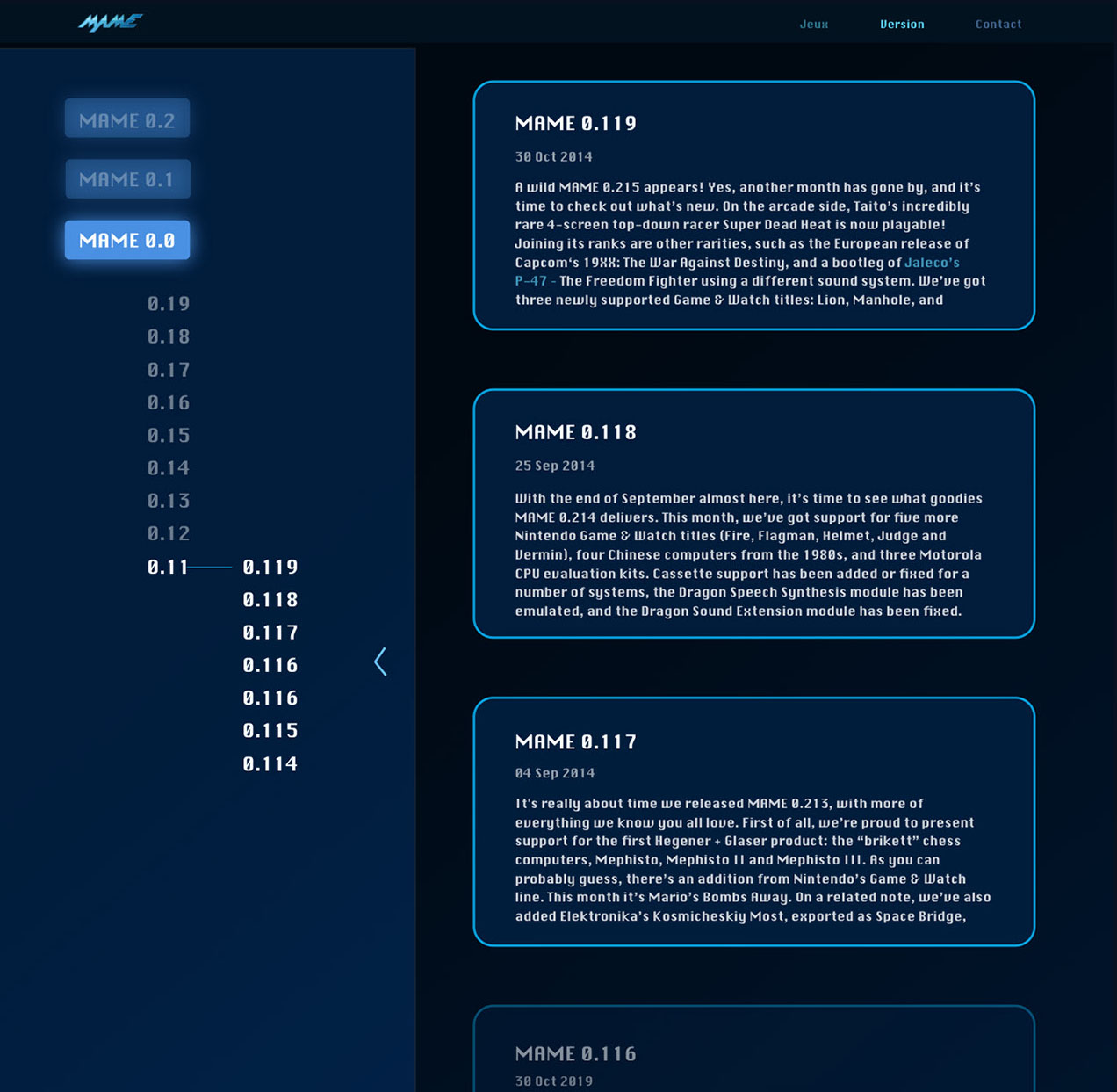
Lists of updates - Mame redesign
Solution
solution
Final Video
Solution
Evaluation
After the new version of the Mame website was completed, we ran a SUS test again to see if our goal had been achieved. We can see a clear increase in the statistics which prove that we have succeeded in improving the site.
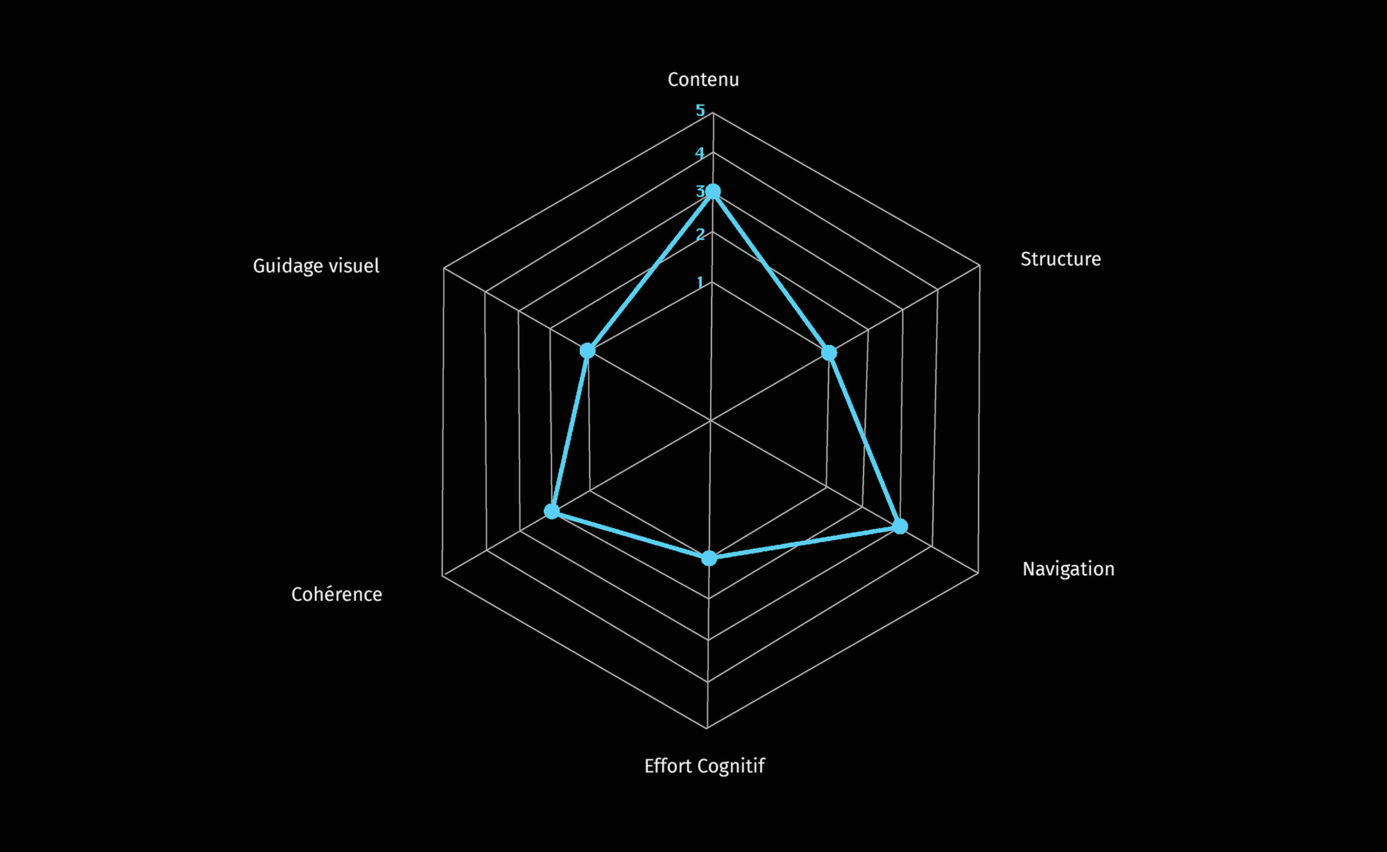
First result - SUS test
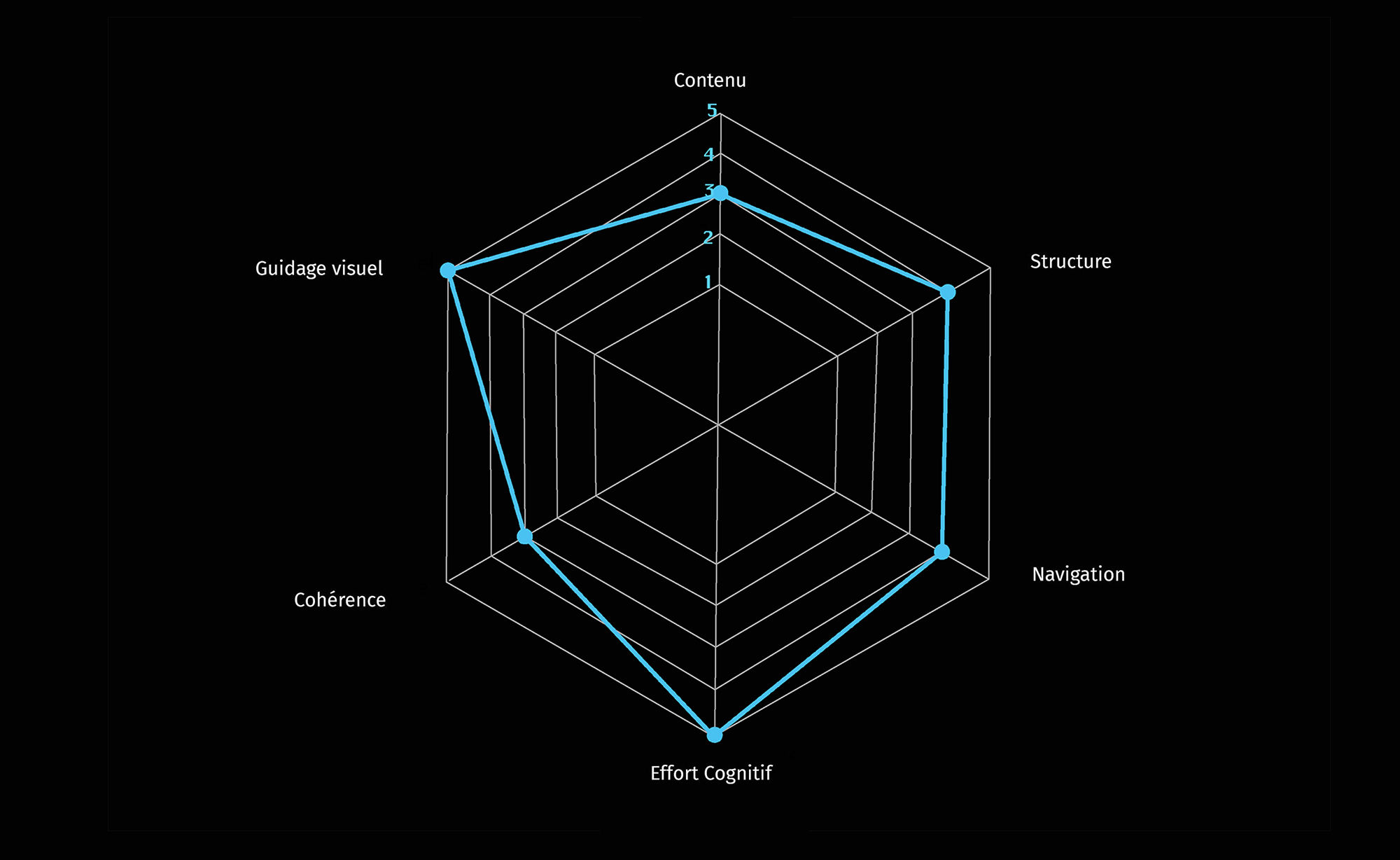
New result - SUS test
solution
Lesson to be learned
This was my first complete redesign of a site. I’m aware that I was lucky to be redesigning a site that had a lot of weaknesses, which made the research phase much easier to complete. A real challenge would be to redesign a more modern site. Doing in-depth research on usability details and micro interaction.
As the project is on a short term basis, we cannot go deeper into our research in order to go further towards our goal, which is to provide an intuitive and easy to use service for all types of users.
In order to achieve this goal, we would need to work on a long term project, in order to iterate and test the use of the new site to improve it continuously.
You may also like


This doesn't have
to be over!
Let’s chill and chat about your project
Send me an


© 2021 Robin Exbrayat · All rights reserved